

Why Typography Matters for Your Brand Personality
Ever wonder why some brands instantly feel trustworthy, playful, or luxurious—before you even read a single word? The secret isn’t magic, it’s typography. Fonts aren’t decoration; they’re your brand’s voice in visual form.
Image courtesy of Unsplash.com
The problem?
Inconsistent or mismatched typography can confuse your audience, weaken brand recognition, and make your business appear less professional. The good news is that with the right approach, font choices can reinforce your brand personality and build stronger connections with your customers.
Image courtesy of Unsplash.com
The Psychology of Fonts: How Typography Shapes Brand Identity
Every font carries emotional weight. Serif fonts like Times New Roman or Garamond often suggest tradition, reliability, and authority. Sans-serif fonts such as Helvetica or Arial feel modern, approachable, and clean. Script fonts lean into creativity and elegance, while bold display fonts can be playful or dramatic.
When chosen thoughtfully, typography enhances your message. For example:
A law firm using a whimsical script font would send the wrong signal.
A children’s brand using rigid, corporate fonts might feel unapproachable.
A wellness brand pairing calm colors with soft, rounded fonts communicates trust and care.
Your audience subconsciously interprets these cues, shaping how they perceive your professionalism, personality, and values.
“Our new team logo is equal parts fun and professional—exactly what we hoped for. Patrick captured our spirit perfectly.”
Typography Consistency: Why Using the Same Fonts Builds Trust
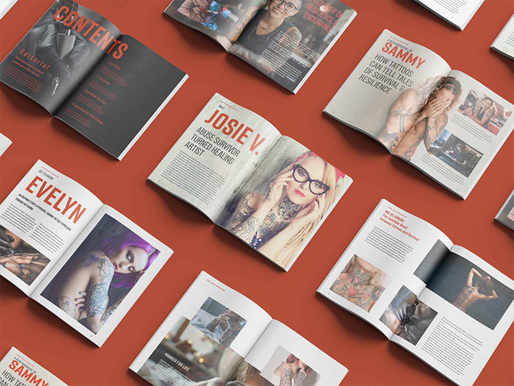
A sample layout of a tattoo magazine. Layout by Patrick Dunn ©
Inconsistent typography is one of the fastest ways to dilute your brand identity. Using a different font for every platform may seem harmless, but it creates visual dissonance. A brand that feels cohesive across its website, social media, packaging, and print builds recognition faster—and recognition builds trust.
Think about global brands: Apple relies on sleek, minimalist typefaces, while Coca-Cola’s script is instantly recognizable. Their consistency reinforces their story at every touchpoint.
To achieve the same:
Define primary and secondary fonts in your brand guidelines.
Use one typeface family across digital and print when possible.
Pair fonts thoughtfully (e.g., one for headings, one for body text).
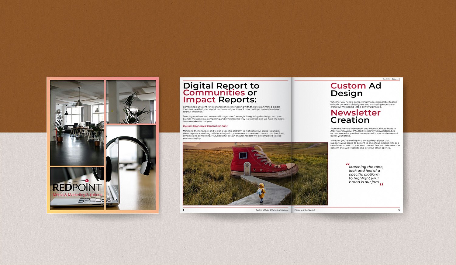
A promotional magazine cover and inside spread sample. Design by Patrick Dunn ©
How to Choose Fonts for Branding: Match Typefaces to Personality
Selecting the right typography starts with clarity about who you are as a brand. Here are practical steps:
Identify your brand traits. Are you professional, playful, innovative, or luxurious?
Match traits to font styles.
Professional → Serif or clean sans-serif
Playful → Rounded sans-serif or quirky display fonts
Luxurious → Elegant serif or script
Innovative → Geometric sans-serif
Test for readability. A beautiful font is useless if people struggle to read it.
Check versatility. Make sure the font works well in headlines, body copy, and on different devices.
When possible, invest in high-quality fonts rather than relying only on defaults. The right font family often includes multiple weights (light, regular, bold), giving you flexibility while staying consistent.

The magazine spread uses a simple sans serif font and lots of white space to show snowboarding’s fresh, clean feel. The clear text and open design match the wide, snowy mountains, making it easy to read and reflecting the sport’s energetic, modern style. Layout by Patrick Dunn ©
How to Choose Fonts for Branding: Match Typefaces to Personality


It’s tempting to choose fonts based purely on style, but functionality matters just as much. Overly decorative typefaces can hurt readability, especially on small screens. On the flip side, relying solely on “safe” fonts may strip away personality.
A smart solution is pairing:
Use a distinctive font for headings to capture attention.
Balance it with a simple, legible font for body text.
This approach blends personality with practicality, giving your brand a unique voice while keeping communication clear.
How to Choose Fonts for Branding: Match Typefaces to Personality


Consider a café rebranding its identity. Switching from generic Arial to a warm, hand-lettered script instantly conveys coziness and authenticity. Pairing it with a clean sans-serif for menus ensures clarity while maintaining character.
Or think about a tech startup. Using a futuristic geometric sans-serif creates a sense of innovation, while pairing it with a neutral serif for blogs balances professionalism with creativity.
Typography choices don’t just decorate—they influence how customers feel about your business before they even read the words.
Conclusion: Let Your Fonts Do the Talking

Image courtesy of Unsplash.com
Typography isn’t just about looking good—it’s about being understood.
The fonts you choose quietly shape how people perceive your brand, from authority to playfulness, luxury to innovation. Consistency builds recognition, and recognition builds trust.
Now it’s your turn:
👉 Take a look at the fonts you’re using today. Do they align with your brand’s personality—or are they sending mixed messages?
If you’re not sure, start with a simple typography audit: list your go-to fonts, check how consistent they are across your platforms, and ask if they truly reflect your brand values.
💡 Want a second opinion? Reach out to me for a quick brand audit. Sometimes the smallest design tweak makes the biggest difference.
Patrick Dunn - Design Virtuoso at Shifting Focus