

Zephyr Airways: A Brand Identity & Typography Concept
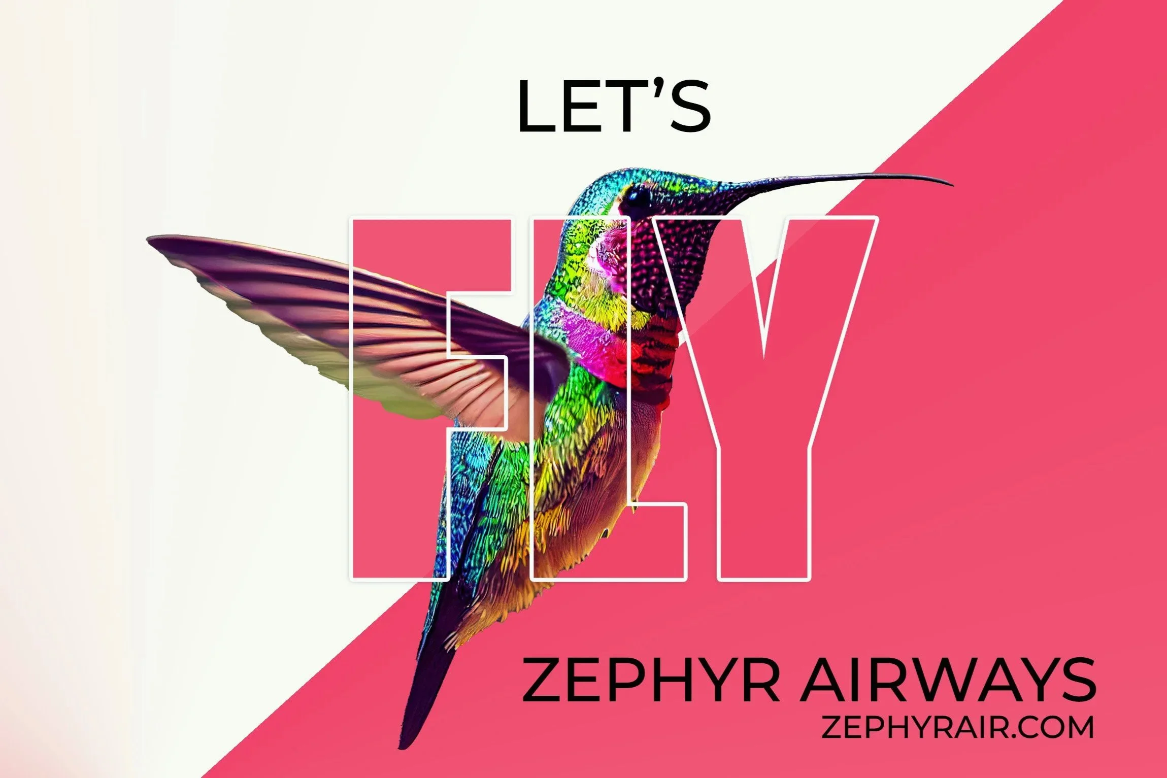
Redefining the Art of Airline Marketing
I translate complex technical concepts into clean, high-end visual identities that build immediate market trust.
-
The Sonic Boom: I used atmospheric gradients to simulate a "sonic boom," giving the impression of a jet physically punching through the air.
-
I paired a paper plane silhouette with a high-performance jet shadow—a metaphor for travel that is as simple as a toy but as fast as an interceptor.
-
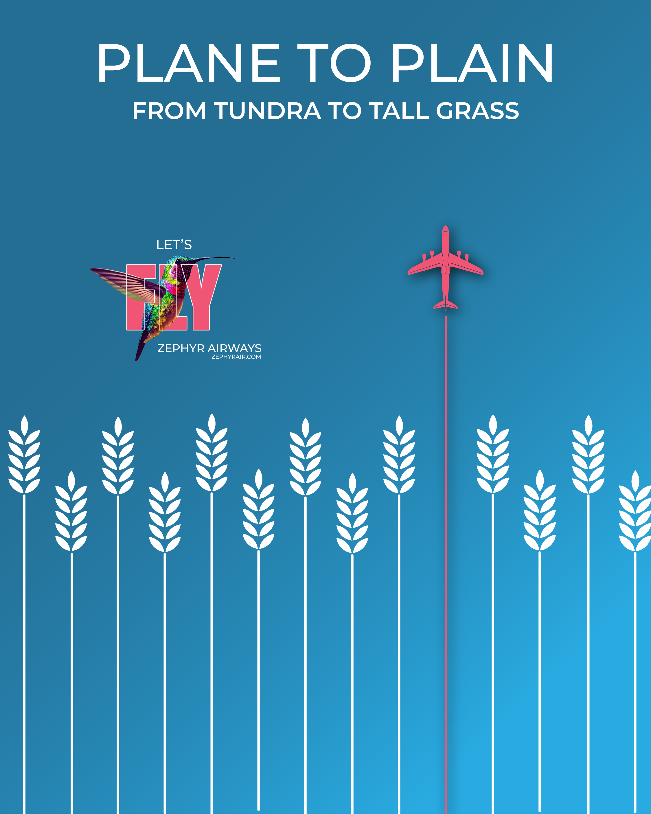
I simplified the geography of the Great Plains into minimalist icons to emphasize the speed of trans-border travel.
The Result
By stripping away the technical noise,
I created a brand identity that feels both high-tech and high-art—positioning the airline as the definitive choice for the modern traveler.
-
In complex industries, minimalism isn't just a style—it’s a signal of competence.
I handle the technical execution so your brand can lead the vision.
“Insight: In a market of complex logistics, I use minimalist design as a “visual shortcut.”
By stripping away the noise, I allow the brand’s efficiency and precision to speak for itself.
”
Ready for Takeoff?
I help brands translate complex services into clean, high-converting visual narratives. I handle the technical execution of your vision so you can focus on leading your company.

Precision Matters.
Let’s turn your project into a high-converting digital asset.
Email Me DirectlyCalgary & Beyond | 24hr Response